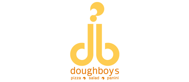
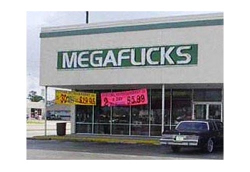
When starting a company, it is important that you stand out from the rest of your competitors. One thing you can do to ensure that is to have an easily recognized logo that is simple and to the point. Something that people will see and instantly associate you and your product with that logo. These people failed miserably at that goal.
When you see these logos, you’ll associate them with something all right… but it won’t be what the company intended.
1.) If you REALLY love dogs.
2.) Is that where it comes from!?
3.) Glad I have FiOs.
4.) I think I’ll just buy a new one.
5.) That sausage must be delicious.
6.) Also, Bench Stinker!
7.) Not too sure what is going on here.
8.) My kids will never go there.
9.) This Chinese Restaurant should just stick to “#1 Chinese.”
10.) “Our prices won’t screw you, we swear!”
11.) Hey, if little Timmy wants one, he can have one.
12.) Oh no. Just no.
13.) These pizzas don’t seem to delicious.
14.) Font selection is key.
You would think someone would have caught these interpretations somewhere along the line, but I guess not. Thankfully, the public had a chance to see these disastrous design fails. Just, wow. Click below to share them with others!

