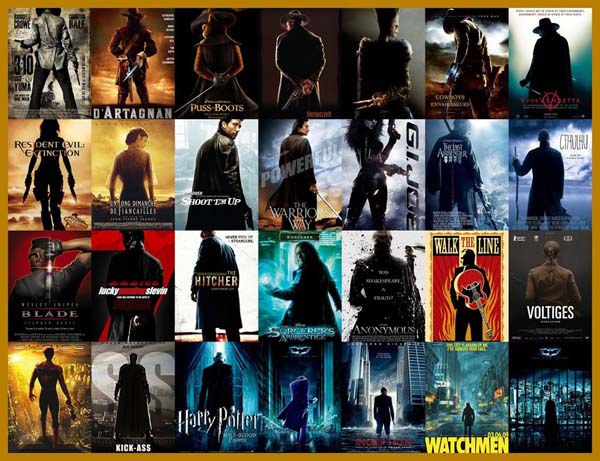
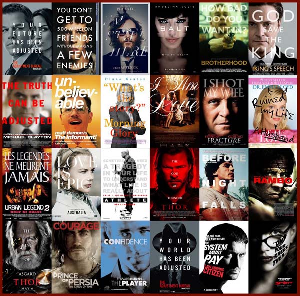
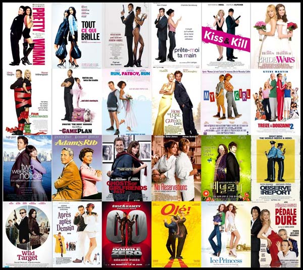
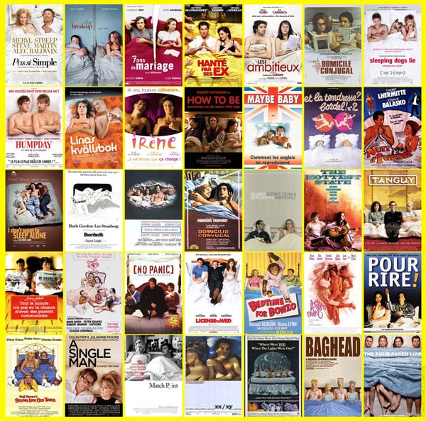
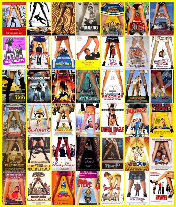
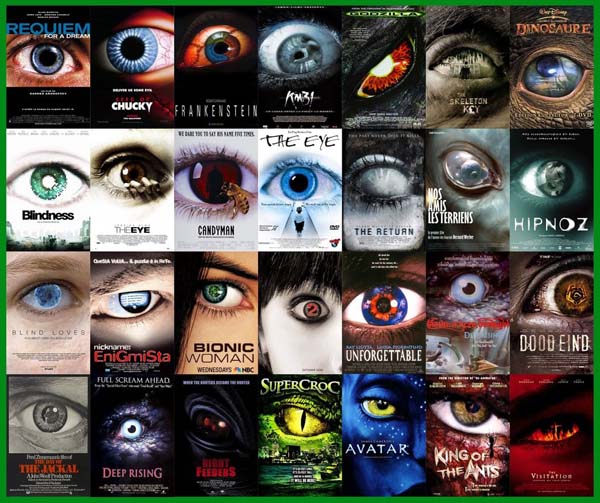
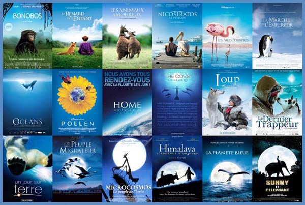
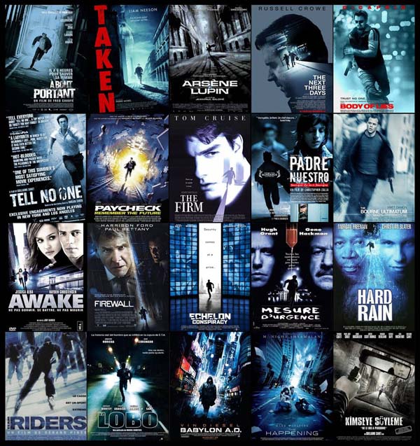
Watching movie trailers and admiring the posters for new films is fun… but there is something you’ve probably never noticed your entire life. Each of us have seen thousands of movie posters, but have you ever really looked at them? Blogger Christophe Courtois (among others) discovered some striking similarities between literally hundreds of movie and television promotional posters. Basically? Hollywood has run out of good ideas. Studios use the same design, color scheme and even fonts in countless movie posters. See for yourself.
1.) Big heads in the sky, set over tiny people on a beach.
2.) A shot from the back (often while a character is holding a weapon).
3.) Big text on big faces.
4.) A couple (or partners) leaning back-to-back.
5.) A pair of people in bed.
6.) A shot through the legs.
7.) ONE. BIG. EYE.
8.) An overwhelmingly blue poster with a natural focus.
9.) People running for their lives (often at strange angles).
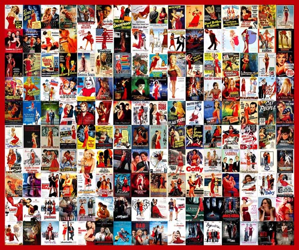
10.) A woman posing in a cute, red dress.
(H/T Christophe Courtois) There can only so many original ideas or plot lines. If you think about, every original thought has probably already happened. That’s why so many stories, books, films, poems and artwork seem so similar over the decades or centuries. … but there’s no excuse for this lack of originality. Yikes. Share these crazy Hollywood coincidences with others. You’ll never un-see this.

