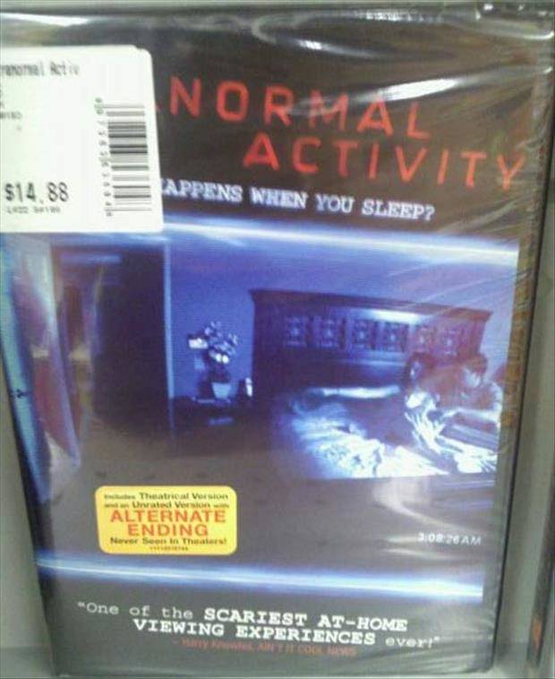
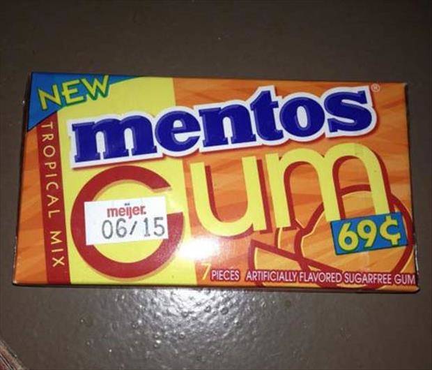
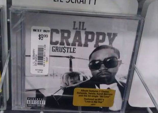
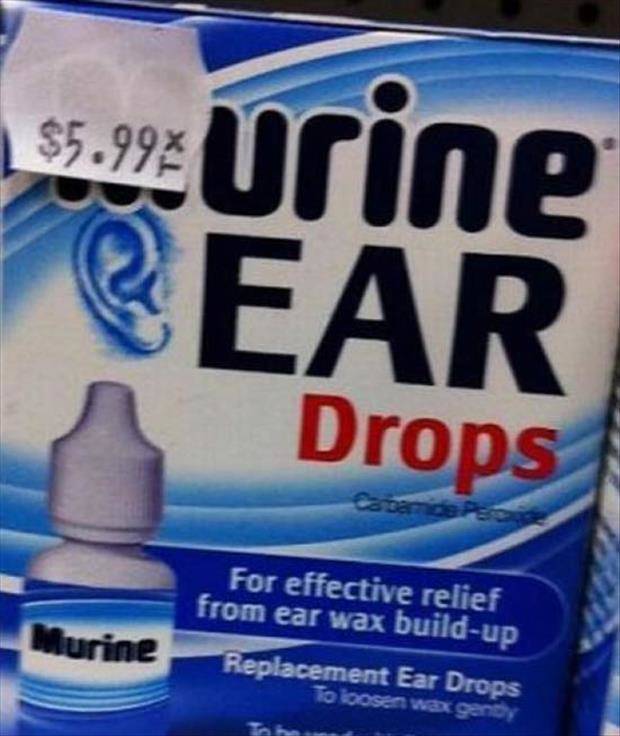
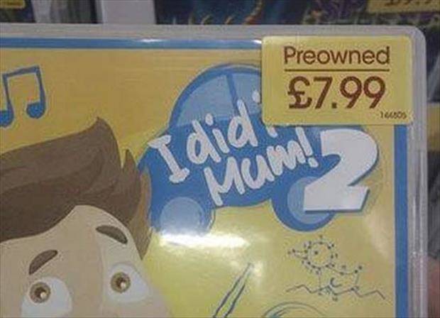
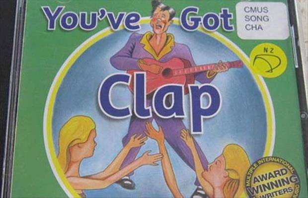
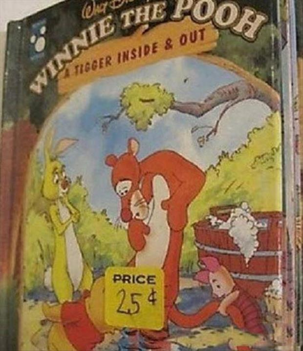
Think about the amount of work and thought that goes into making the package or product cover. It’s hard to believe that something as simple as where a little sticker is placed can undermine the entire product. Place a sticker a few centimeters to the left on the cover of Moby Dick and, well, you get it.
Take a look at these bad sticker placements. If they don’t make you feel awkward, you must have stickers over your eyes, because these are outrageous. Check them out below. Only if you think you can handle it, of course.
1.) Oh my.
2.) Good for him.
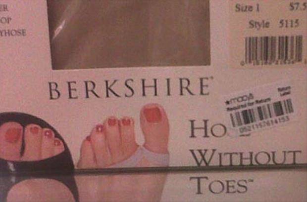
3.) Those sure look like toes to me.
4.) Get a room, you two.
5.) Seems harsh.
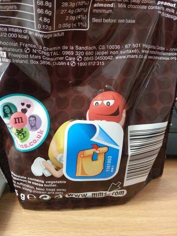
6.) Who’s a good tasting boy?
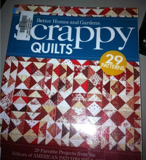
7.) Yeah, that looks pretty lousy to me.
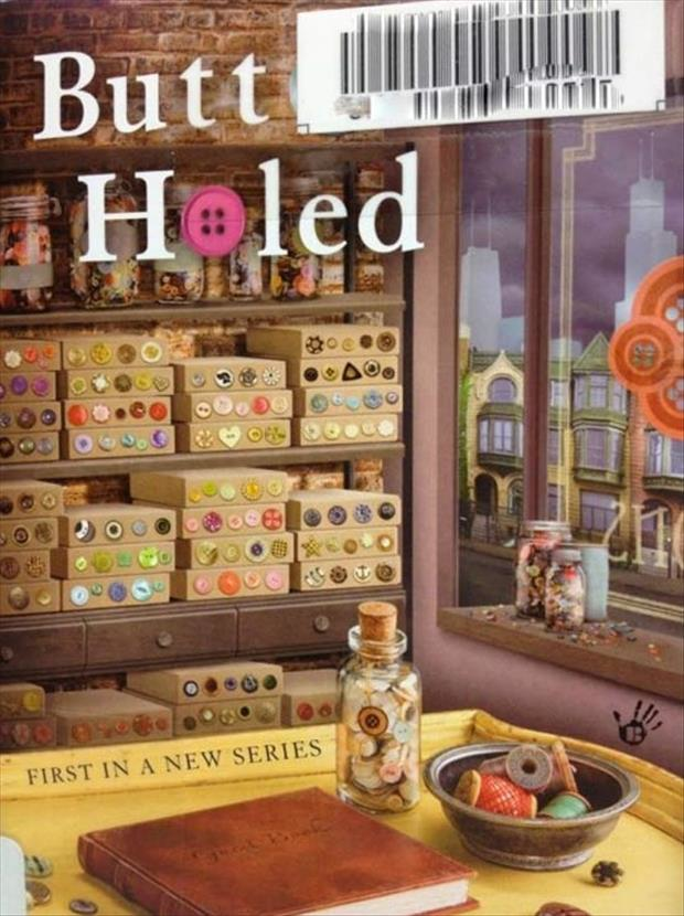
8.) Anal this?
9.) Ooh! The first in a new series.
10.) I think you’d remember.
11.) Better safe than sorry.
12.) Boring.
13.) Um.
14.) Gross.
15.) At least he’s honest.
16.) No thank you.
17.) TMI!
18.) Ouch.
19.) I thought this was a children’s book.
20.) Ew!
(via BuzzFeed)
So. Incredibly. Awkward. Some of these are so perfect, you have to wonder if an employee was doing their best to get fired that day.


