How often have you seen the logos for famous companies like McDonald’s and Amazon? Unless you’ve been living underneath a rock without an Internet connection, the answer is likely more times than you can count. You’d think that, given how often they’re in front of our eyes, we’d pick up on little nuances and maybe even hidden messages in these equally famous logos, but apparently that’s not the case. How did we miss these?
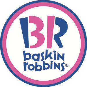
1. Baskin Robbins
The pink “3” and “1” that help make up the “B” and “R” represent the 31 flavors the ice cream chain offers to their customers.
3. Le Tour de France
The world-famous cycling event has a competitive cyclist riding the word “Tour.”
4. Amazon
This website has everything you could want, from A to Z, and they’ll give it to you with a smile, too.
5. Cisco
The San Francisco-based company found a way to pay homage to the Golden Gate Bridge in their logo.
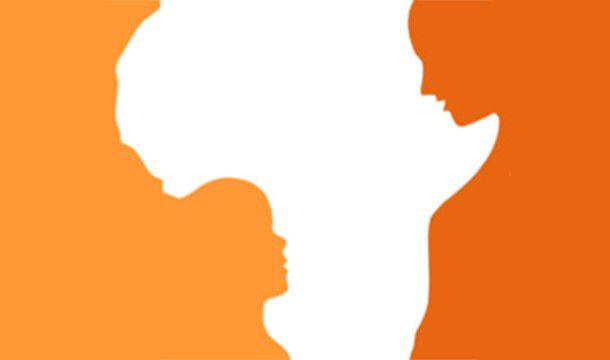
6. Hope for Children Initiative
You can see a young child looking up to an adult in the edges of the African continent.
7. Adidas
The athletic apparel company found a way to work their famous three stripes into a mountain that represents the challenges their athletes will face on the way to success.
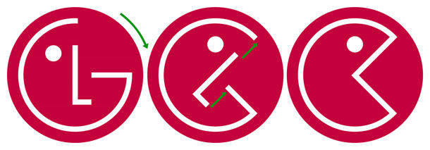
8. LG
The “L” and “G” make up a happy face, which represents how the company would like their customers to feel.
9. Wikipedia
The unfinished globe made up of puzzle pieces represents how the quest to find all of the world’s data is unending.
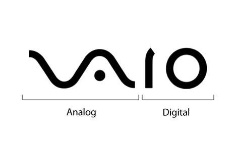
11. Sony Vaio
The Vaio logo is made up of the analog and digital wave patterns. Pretty clever!
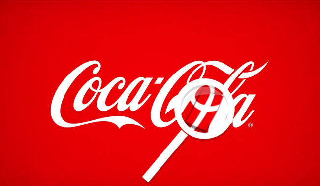
12. Coca-Cola
While it’s unclear if this was an intentional move by the Coca-Cola company, if you look closely, you can find a Danish flag in the soda company’s legendary logo.
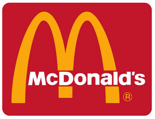
13. McDonald’s
When the fast food company was looking for a new logo in 1960, they consulted psychologist Louis Cheskin. He suggested the famous golden arches because they resemble “a pair of nourishing breasts.”
14. Northwest Airlines
With the help of the triangle, which points northwest, the italicized “N” becomes a “W.”
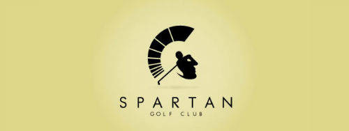
15. Spartan
The swing of the golfer featured in the Spartan logo also creates the bust of a Spartan warrior.
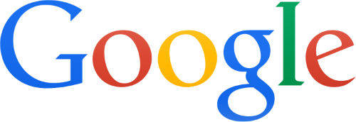
16. Google
While it might be hard to believe, the green “l” is actually an act of rebellion. The letter, which is the only one in the logo that isn’t a primary color, indicates that this company isn’t like the others.
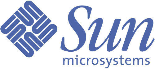
17. Sun Microsystems
You can’t look anywhere in the diamond-shaped logo and not see the word “SUN.” If you know to look for it, at least.
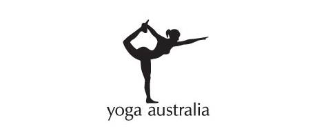
18. Yoga Australia
If you look closely, you’ll see Australia in the whitespace between the yogi’s right arm and foot.
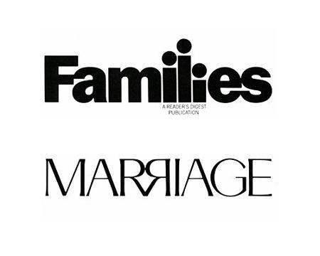
19. Families / Marriage
The “ili” in Families looks like a little family and the “RR” in Marriage looks like a couple reciting their vows.
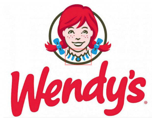
20. Wendy’s
If you look at the beloved redhead’s collar, you can see the word “MOM” made up of the vertical blue lines and broach.
(via UNB Facts)
How have I never noticed these before? I must drive past a McDonald’s every day and I never would have guessed that there was a hidden message in that logo. This makes you wonder what kind of hidden messages are still out there.
 share
share
 share
share
 share
share
 share
share
 share
share
 share
share
 share
share
 share
share
 share
share
 share
share
 share
share
 share
share
 share
share
 share
share
 share
share
 share
share
 share
share
 share
share
 share
share
 share
share
