Can you remember a time before Google was the search engine that dominated the Internet? Not many of us can. Google as we know it today came to be back in 1998 as the brain child of Larry Page and Sergey Brin.
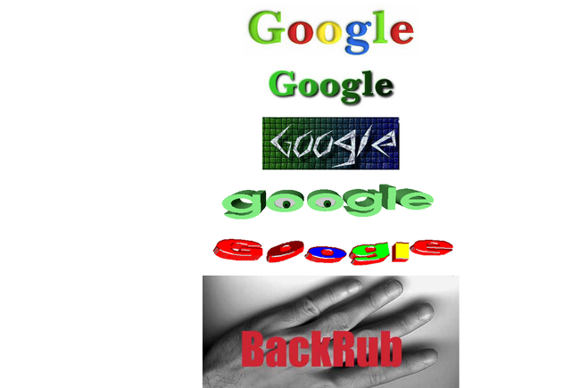
Originally Google was going to be called BackRub. Thankfully Larry and Sergey changed the name, and never looked back. Thanks the power of The Way Back Machine, which archives websites, we can take can take a look at Google during those early years.
Warning. Examples of painfully bad examples 1990’s and early 2000’s web design are ahead.
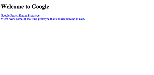
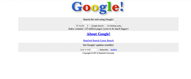
This is what the Google homepage looked like in 1997. Pretty sparse right?
Clicking the top link would take you here.
And clicking the bottom one would take you here.
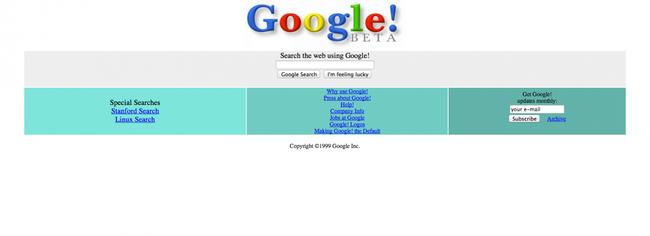
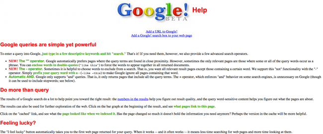
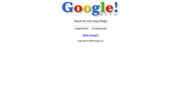
By December 1999 the Google Beta was the homepage. Here’s what the about page looked like.
Going back in time using the Google logo. Can’t believe they almost called it BackRub. That would have been weird.
In 1998 this was the first Google logo doodle. It’s a picture of the Man at Burning Man. Larry and Sergey created it to let visitors to the site know where they were for a week.
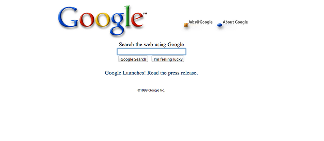
A snap shot from mid-1999. Looking more like the Google we know and love today.
Google finally emerged from beta in October 1999. Ain’t she a beauty?
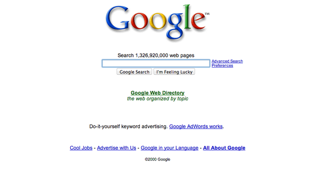
Hurrah! We’ve reached the end of 2000, and Google is looking more normal. Also note the appearance of Google AdWords.
At this point Google was available in 25 languages. Today, that number is 80.
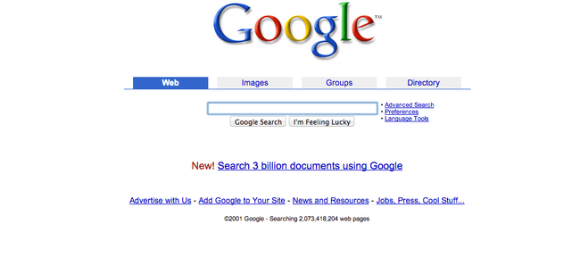
Tabs were added to search for different things in 2001.
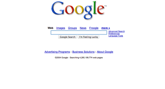
The blue boxes were taken away in 2004.
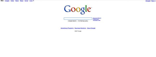
The menu options at the top appear.
In 2010 Google finally ditched the weird shading on its logo.
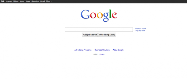
The black box at the top was added in 2011.
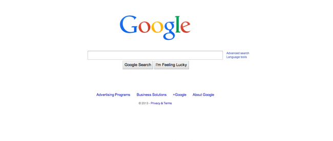
Another slight logo change in 2013.
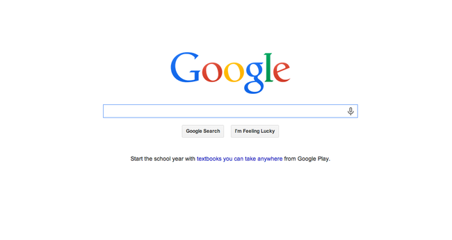
This is what Google looks like now. Super elegant, and amazingly beautiful.
BONUS!
Check out what a few of your other favorite websites used to look like back in the early days of the Internet.
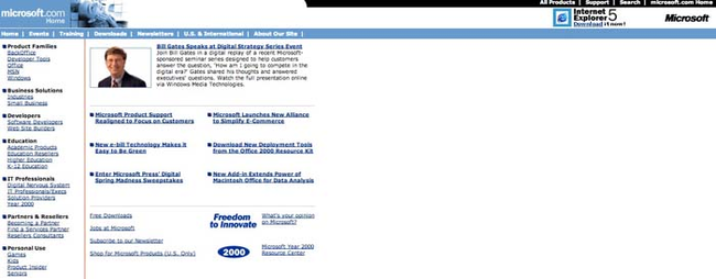
Microsoft’s old website is painful hilarious.
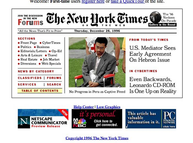
Nytimes.com from 1996.
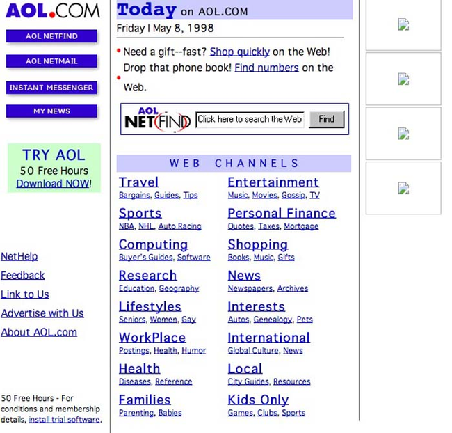
AOL.com from 1998.
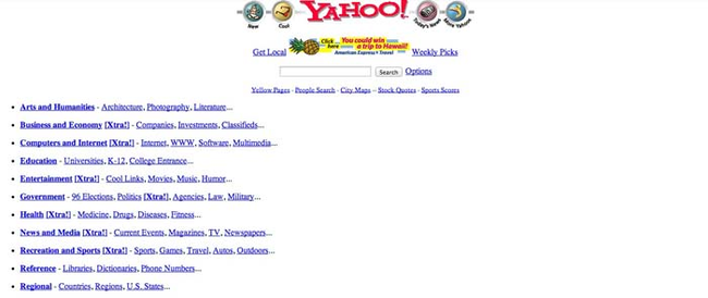
Yahoo.com from 1997.
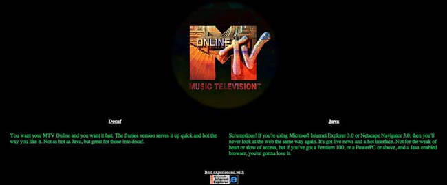
MTV.com from 1997.
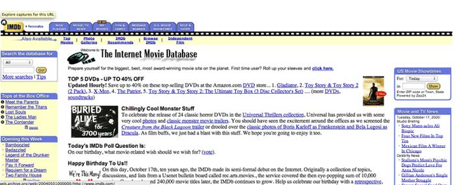
IMDB.com from 2000.
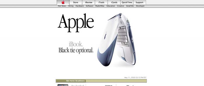
Apple.com from 2000.
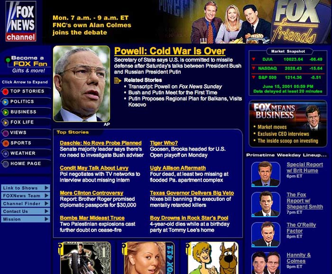
FoxNews.com from 2001.
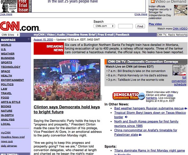
CNN.com from 2000.
Microsoft.com from 1999.
(H/T: Business Insider)
The Way Back Machine is a pretty cool way to see what websites used to look like. Show your friends how terrible their favorite websites used to look by clicking below to share this story on Facebook.
