Big sports fans know that when choosing a team, a good logo is of utmost importance. Good franchises know that their fans will love standing behind a team with a fierce, inspiring logo. Talent helps, too. (Sorry, Cleveland Browns.)
However, throughout history some missteps have been made when it comes to designing logos. Some of these logos never made it far, while others were officially used for years. No matter what, each of them will leave you scratching your head…
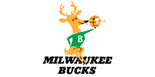
1.) This Milwaukee Bucks logo looks like it was ripped from Rudolph. All that is missing is the red nose.
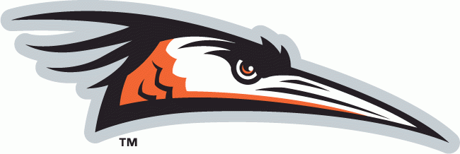
2.) The Delmarva Shorebirds are a minor league baseball team who could use a different logo to strike fear into the hearts of their opponents.
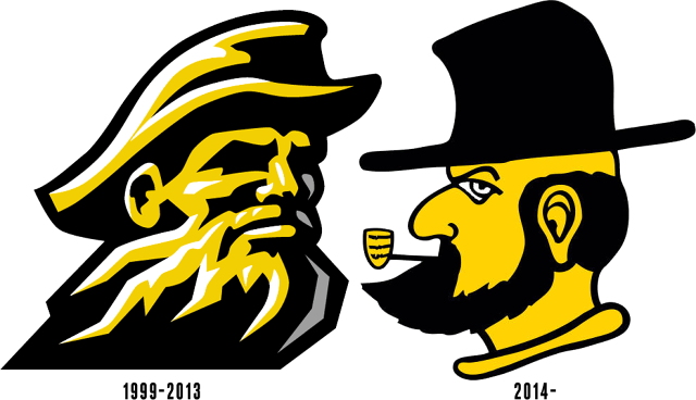
3.) How can a logo go so radically backwards as this one? The Appalachian State college mascot has take several steps backwards.
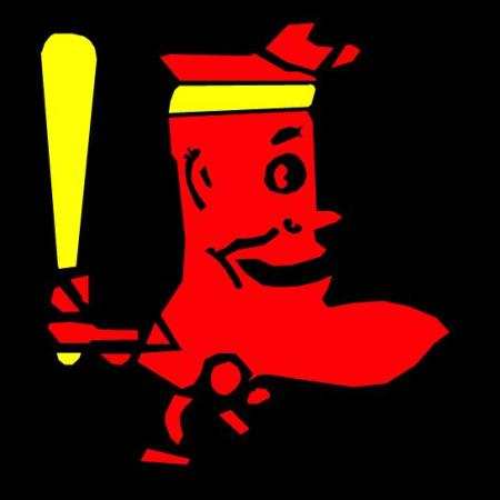
4.) This Boston Red Sox logo is not only poorly drawn but is frightening.
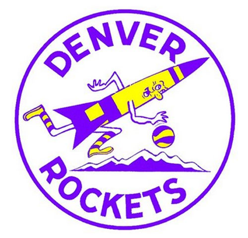
5.) The Denver Rockets basketball team logo looks more like it was in a cute PSA about outer space in the 1950’s than a team logo.
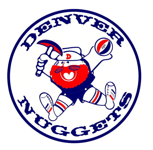
6.) Not sure where this miner’s legs are going but not in the same direction, which is never good. Also, his feet look like they’d be in quite a painful position.
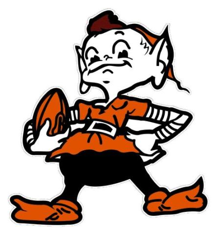
7.) The Cleveland Browns used this elf as a mascot and logo for seemingly no reason because I can’t think of a reason why an elf and a “brown” would make sense at all.
8.) I feel like my little niece could draw a better logo for the Cleveland Indians than this work of non-art that they donned for years.
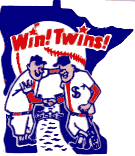
9.) The Minnesota Twins have difficulty with their logo because how do you make twins your mascot without it looking incredibly stupid. Like this depiction.
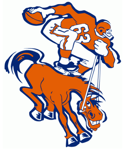
10.) I think that huge man who appears to be an offensive lineman is too big to be standing on that horse on this Denver Broncos logo.
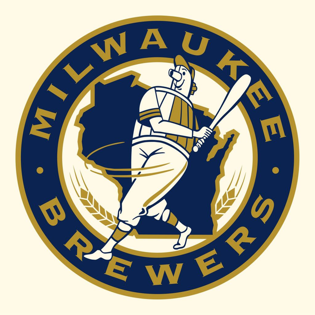
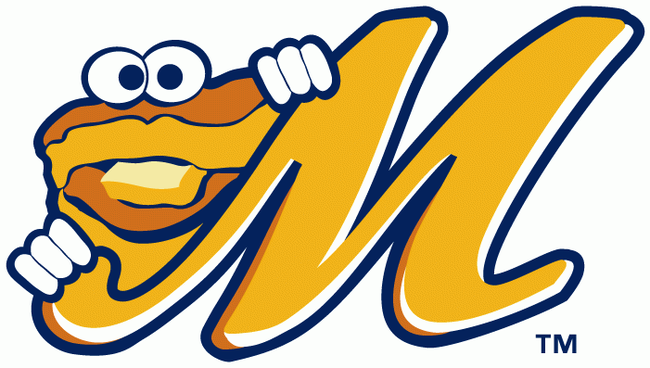
11.) This old Brewers logo features a man with a keg for a chest.
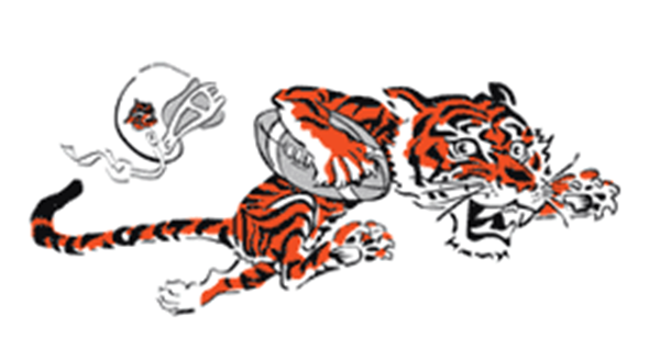
12.) This Bengals logo features a tiger that looks like it is afraid of its own helmet.
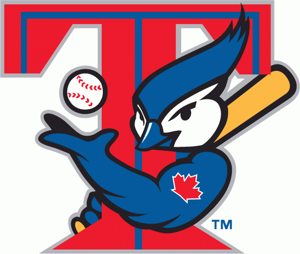
13.) Look at how buff that Toronto Blue Jay is. He’s been hitting the weights for this pose.
14.) This old Vancouver Canucks logo is about as vague and abstract as the team’s name. Fitting.

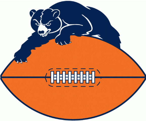
15.) The Chicago Bears old logo looks…rather…seductive.
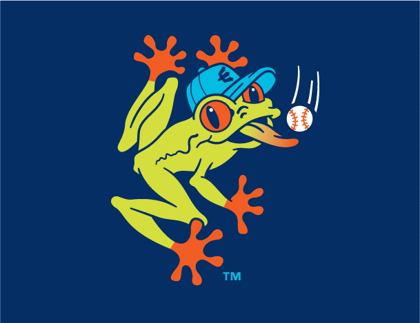
16.) This is a Minor League Baseball team’s logo for a team called The Aquasox. I understand, that’s a tough team name to come up with a logo for.
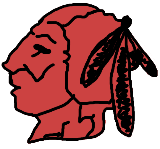
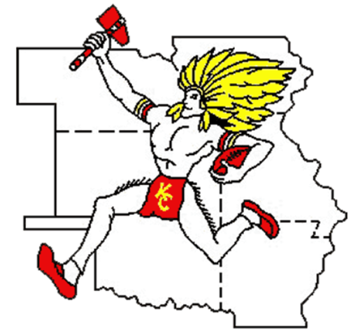
17.) The Kansas City Chief old logo features a Native American who inexplicably has fringe coming off of his bare legs.
18.) One of the most hilarious teams have got to be the Montgomery Biscuits. And their Biscuit logo.
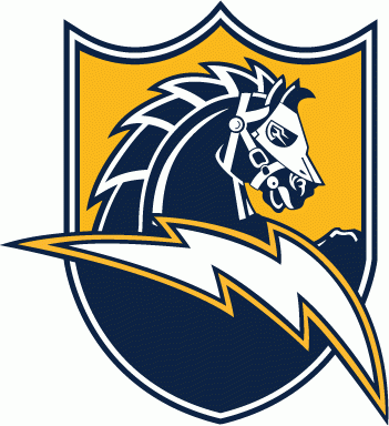
19.) This is back when the Chargers didn’t know if Charger meant a horse charging or an electrical charge, so they just went with both.
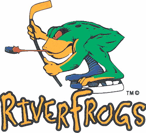
20.) This is just a ridiculous team name so I guess it’s only fitting that the logo is equally as ridiculous.
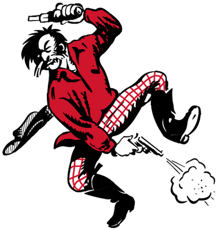
21.) This old 49ers Logo features a man who seems to be a BIT reckless with his firearms.
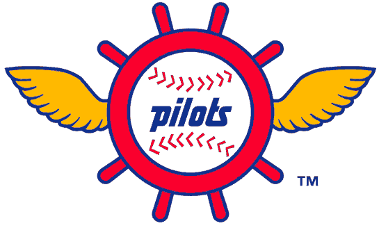
22.) There once was a baseball team named the Seattle Pilots and boy, did they have a bad logo. It was so bad that it seems Seattle abandoned aviation altogether and went right to the ocean with the Mariners.
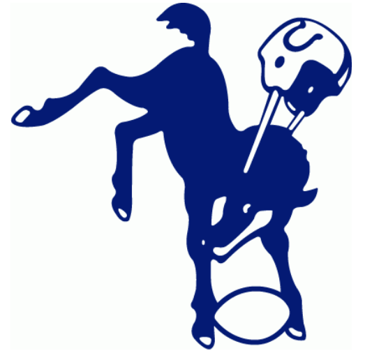
23.) I don’t think that helmet really complies with the NFL’s safety rules. Get your act together, old Colts logo.
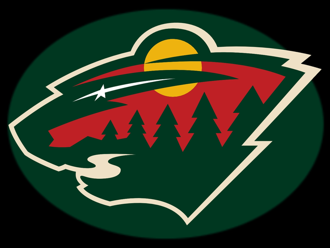
24.) The Minnesota Wild is another example of a team trying to make an abstract word a logo and boy that wilderness scene within an unidentifiable big cat’s head really sums up the word “wild.”
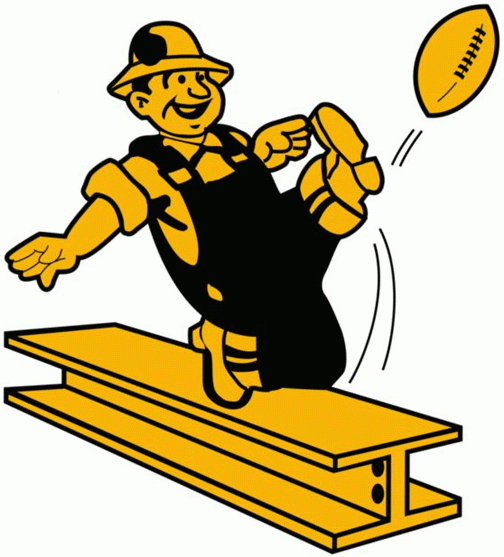
25.) The Steelers used to have a logo featuring a steel worker DANGEROUSLY punting a football off of a bar of steel. I think OSHA needs to be called.
26.) Oh goodness. Too much is wrong with this old Detroit Tigers logo that I don’t even know where to begin.
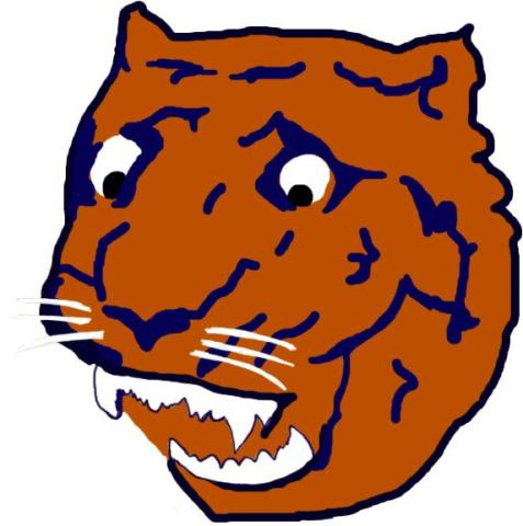
Yikes. Just, yikes. It would be hard to support any team with a logo like that.
Click on the button below to share these awful logos with others. (Hopefully their favorite team didn’t make the list.)


